





What Internal Dashboards and Reporting Apps Actually Need
Internal dashboards are not just lightweight admin panels with a few charts. They usually sit between business users and live operational data, which means they must answer questions quickly, reflect current records accurately, and protect sensitive information by default.
A reporting app for finance, operations, support, or logistics often needs to combine multiple data sources, show filtered views by team or region, and let staff drill from a headline KPI into the underlying records without breaking context.
That is why the first criterion is data and integrations. The best builder for this use case must connect cleanly to SQL databases, APIs, spreadsheets, warehouses, and internal services, ideally with support for live queries, scheduled syncs, and data transformations. The second criterion is security and access control.
Internal reporting often includes payroll, customer, revenue, or inventory data, so strong role-based permissions and row-level visibility matter more than flashy UI.
Third is maintainability. Dashboards change constantly as teams add metrics, revise workflows, and rename fields. If every change requires rebuilding logic from scratch, the tool becomes expensive after launch. Fourth is production readiness.
A builder must handle concurrent users, realistic query volumes, authentication, and dependable performance during daily use. Fifth is ease of build, because many reporting apps are commissioned precisely to reduce engineering backlog. A platform that business teams can safely update has a major advantage.
The sixth criterion is design flexibility. This matters less than security or data connectivity, but it still affects usability. Good dashboards need dense tables, filters, charts, actions, and responsive layouts that work on the devices staff actually use.
For this ranking, the winner is the platform that best balances deep data access, governance, and sustainable maintenance for real internal reporting environments.
The use-case comparison
| Platform | Overall | Advantage | Main reason to exclude it |
|---|---|---|---|
| Retool | 6.8 | Best direct SQL, API, and workflow control for serious internal tools | Too technical for teams that cannot write queries or basic scripts |
| Softr | 8.1 | Fastest path for non-technical teams with strong visual permissions | Layout system is less flexible for highly custom reporting UX |
| Glide | 6.3 | Excellent mobile reporting and simple operational app delivery | Per-user economics and template constraints can limit scale |
| Airtable | 6.3 | Very approachable relational data model for business users | Permissions and interface depth are weaker for sensitive dashboards |
| Replit | 7.4 | Full code ownership and custom analytics stack flexibility | Requires engineering time for auth, governance, and maintenance |
| Bubble | 6.8 | Highly customizable front end and workflow logic | Harder to govern, estimate cost, and maintain for internal BI use |
1. Retool - best for developer-managed data stacks
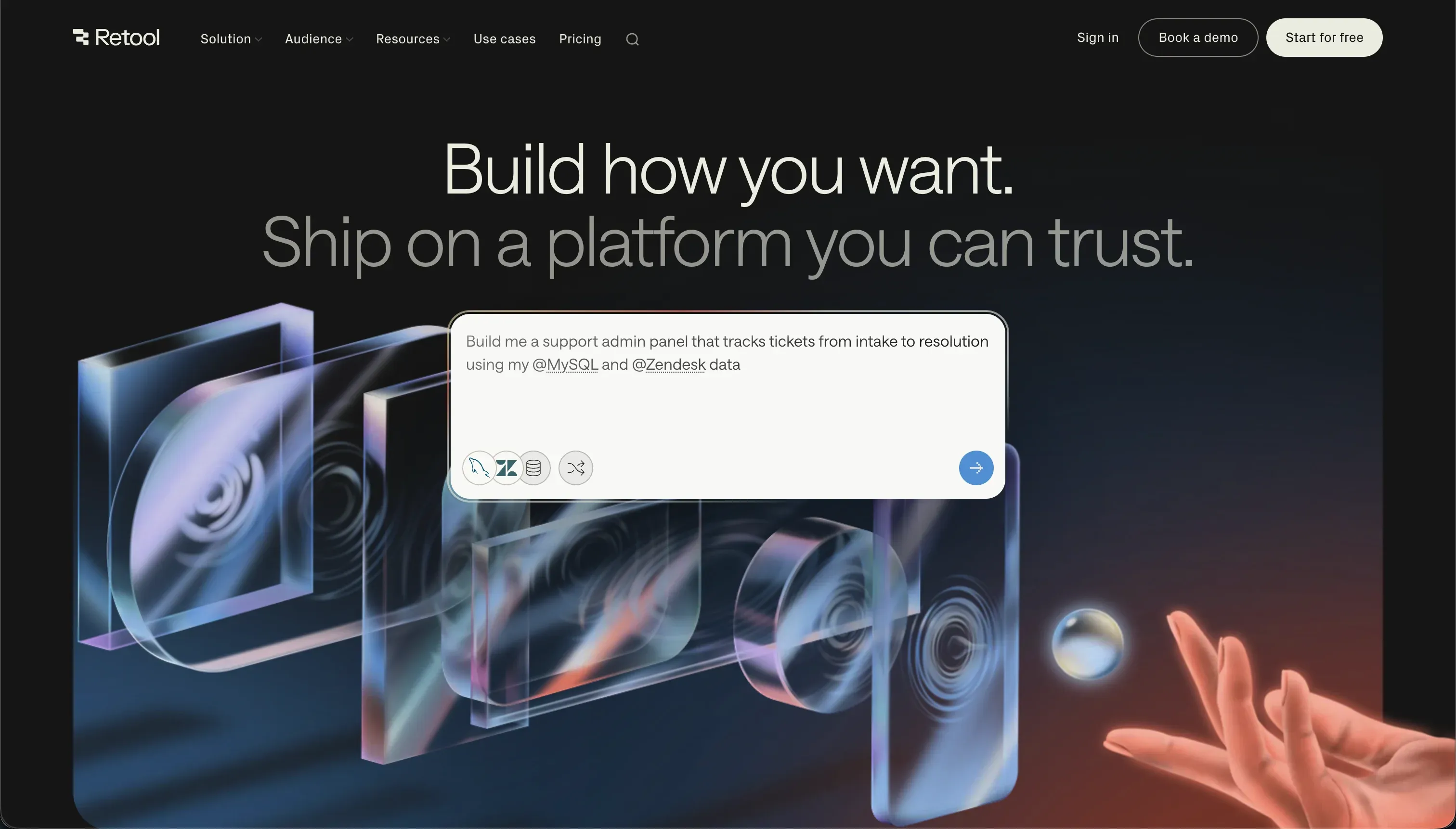 Retool homepage snapshot
Retool ranks first because internal dashboards often live or die on direct access to production data, and Retool is still the strongest builder for teams comfortable with SQL, APIs, and light scripting.
It scores especially well on data and integrations, where it supports direct database connections, query runners, reusable resources, and workflow automation. It also performs strongly on production readiness thanks to mature deployment options, auditability, and enterprise features such as SSO on higher plans.
For reporting teams that need dense tables, filters, drill-down views, approval actions, and write-backs to operational systems, Retool gives far more control than most no-code tools. Its component library is practical rather than decorative, which is exactly what many internal dashboards need. Maintainability is also solid when a technical owner structures queries and resources properly.
The concrete exclusion is ease of build for non-technical teams. Retool demands SQL fluency for most serious reporting setups, and many implementations also rely on JavaScript for state handling or data transformation.
If your finance or operations team needs to own day-two changes without engineering support, Retool becomes a bottleneck instead of a shortcut. It is the best option when the dashboard is business-critical and engineering can actively manage it, but it is not the right platform for self-serve business users.
2. Softr - best for no-code business reporting teams
 Softr homepage snapshot
Softr is the best fit for internal dashboards owned by operations, support, or business teams that need speed without giving up basic governance. Its strongest criteria are ease of build and maintainability.
Non-technical users can stand up a working reporting app quickly, connect structured data sources, define user roles visually, and make common changes without touching code. That makes it especially attractive for departments that cannot wait on an engineering queue for every filter, page, or metric adjustment.
Softr also scores well on security and access control for this category because its permission model is understandable and practical for internal use. Teams can create role-based experiences and separate what managers, agents, or regional leads can see. For many internal reporting cases, that is a better real-world outcome than using a more powerful tool badly.
Its concrete exclusion is design flexibility. Softr uses a block-based system, so teams that need highly bespoke grid layouts, complex multi-panel analytics screens, or advanced custom interactions may hit constraints. It is also less suited than Retool when the dashboard depends on heavy live SQL logic managed by developers.
Choose Softr when the main goal is to let business users launch and maintain a secure reporting app quickly, not when you need maximum interface precision or code-level data control.
- Fast build for non-technical users
- Visual roles and permissions
- Easy to maintain without code
- Limited to block-based layouts
- Weaker for heavy live SQL
- Code-level data control
- Handles heavy live SQL logic
- Suits bespoke analytics screens
- Depends on developer capacity
- Can be used badly in practice
3. Glide - best for mobile operational reporting
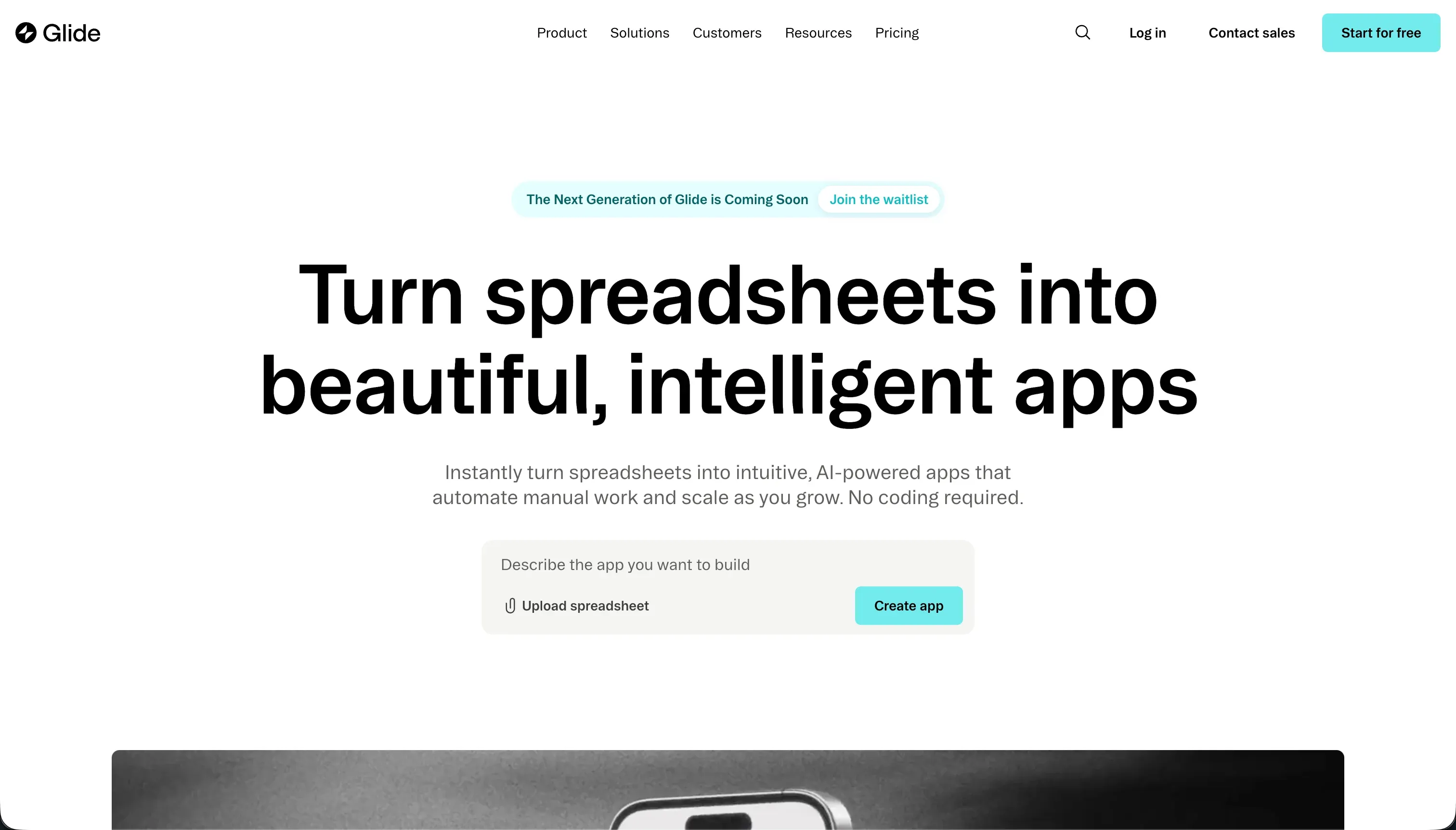 Glide homepage snapshot
Glide earns third place because it is unusually effective for internal reporting that happens away from a desk. If supervisors, field staff, warehouse teams, or service operators need to check status data, log updates, and view simple KPI summaries on mobile, Glide is one of the fastest tools to deploy.
It scores strongly on ease of build and delivers polished default interfaces with minimal setup, especially when the source data already lives in spreadsheets, Airtable, or a structured operational table.
For many companies, that mobile usability matters more than desktop visual complexity. Glide can turn routine reporting workflows into something teams actually use, which is a major practical advantage. It is also fairly maintainable for small to mid-sized internal apps because the model is straightforward and the components are opinionated.
The main exclusion is that Glide is not ideal for sensitive, multi-layered enterprise dashboards. Security and access control are adequate for many use cases, but weaker than the leaders when permission logic gets complex. Design flexibility is also narrower, particularly for dense analyst-style dashboards with advanced filters and large data tables.
On top of that, per-user pricing can become expensive as rollout expands. Glide is best when mobility, speed, and usability matter more than deep governance or highly custom analytics layouts.
4. Airtable - best for lightweight database-first reporting
Airtable remains a strong shortlist option for teams whose internal dashboard is really an extension of an existing operational database.
It performs well on ease of build because business users can understand the data model quickly, add fields or linked records without much friction, and create lightweight interfaces for viewing metrics and records. For local teams tracking projects, requests, inventory, or campaign performance, that simplicity is often enough.
Airtable also scores well on maintainability for straightforward internal systems. If your reporting needs are closely tied to structured tables and basic summaries, it can be one of the easiest platforms to keep current. Business users tend to trust it because they can see and edit the underlying records directly.
Its concrete exclusion is governance for sensitive or segmented dashboards. Airtable is weaker on security and access control than the top two options, particularly when you need strict record-level visibility across multiple departments or regions. Its Interface Designer is also less capable than a dedicated internal app builder for dense, action-heavy reporting experiences.
That makes Airtable a good choice for small-team reporting and database organization, but a weaker choice for company-wide dashboards that require stronger permissions, richer UX, or more controlled production behavior.
5. Replit - best for teams that want full code ownership
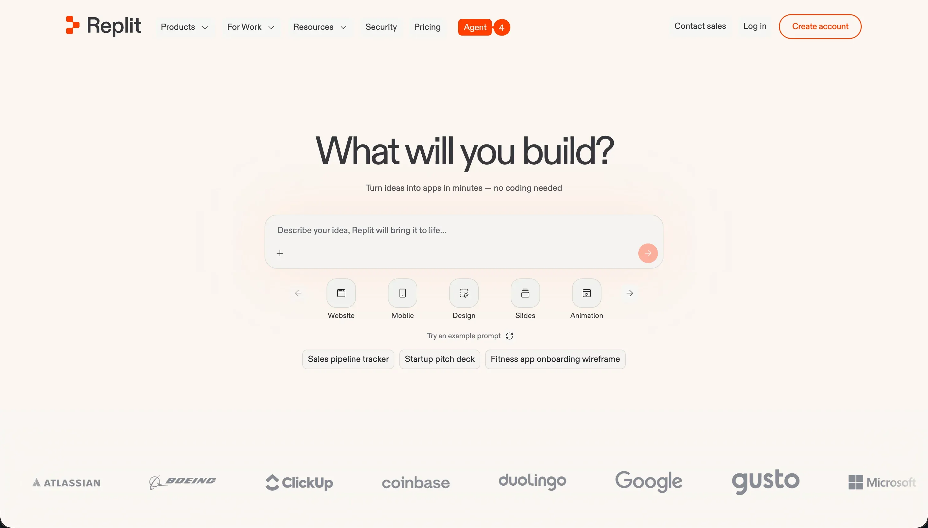 Replit homepage snapshot
Replit is not a traditional no-code dashboard builder, but it deserves inclusion because some internal reporting teams should not use a visual builder at all. If your company wants complete code ownership, custom charting libraries, bespoke authentication flows, or exportable apps without platform lock-in, Replit gives developers a fast environment to generate and ship reporting tools.
It scores strongly on design flexibility and can score well on production readiness when a capable team owns deployment, infrastructure choices, and quality control.
This makes Replit attractive for technical organizations building internal dashboards around Python, React, or custom analytics logic. It is also a credible option when reporting requirements are evolving too quickly for a fixed visual framework.
The concrete exclusion is that Replit shifts responsibility back onto your team. Security and access control must be implemented deliberately, data access patterns need engineering oversight, and maintainability depends on how disciplined your codebase becomes over time.
Non-technical users will not be able to safely update the app in the way they could with Softr or Airtable. Replit is the right pick only when custom logic and ownership matter more than visual simplicity, and when engineering is prepared to support the tool as a real software product.
6. Bubble - best for custom internal reporting experiences
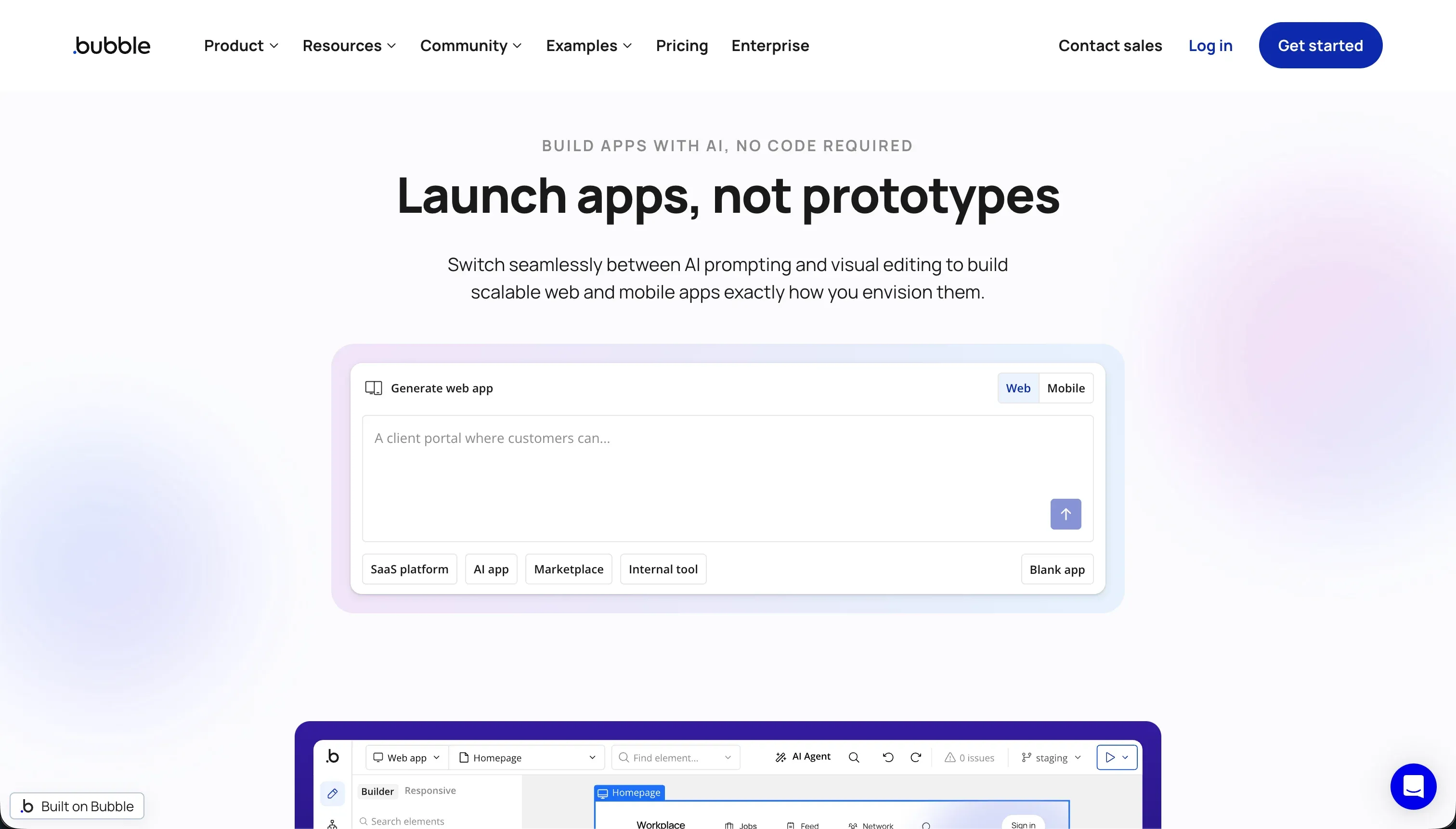 Bubble homepage snapshot
Bubble ranks sixth because it can produce very customized internal dashboards, but it is rarely the most efficient path for this specific use case. Its best criterion is design flexibility.
Teams can create tailored interfaces, multi-step workflows, and database-backed views that look far more bespoke than what many block-based builders allow. That can be useful when internal stakeholders want a single tool that mixes reporting, approvals, forms, and unusual UI behavior.
Bubble also has respectable workflow depth, which helps when dashboards need more than passive charts and tables. If an internal app includes exception handling, escalations, follow-up tasks, or complex business logic, Bubble can support that better than simpler builders.
The concrete exclusion is operational predictability. Bubble is weaker than Retool for direct SQL-centric reporting and weaker than Softr for maintainable, business-owned dashboard administration. Privacy rules require careful setup, performance can become difficult to reason about on data-heavy screens, and workload-based costs can be hard to forecast as usage grows.
For internal dashboards that need dense data access, strict governance, and easy handoff to business users, Bubble introduces more complexity than most teams need. It is best reserved for cases where custom UX is worth the extra operational overhead.
How to Shortlist and Pilot Your Dashboard Builder
Start your shortlist by identifying who will maintain the dashboard after launch, not just who approves the purchase. If engineering will own the app and your reporting depends on live SQL, APIs, and write-backs, begin with Retool.
If operations or business teams need to own updates themselves, start with Softr and compare it against Airtable for simpler database-led use cases. If your reporting is used mostly on phones by field staff, add Glide.
In the pilot, test with real conditions instead of a demo dataset. Import or connect a representative table, build a filtered KPI page, and then verify whether permissions truly restrict records by user role. Also test day-two maintenance: ask a non-technical owner to add a field, revise a filter, and update one metric definition. That exercise often reveals more than feature checklists do.
For scoring details and weighting logic, review our methodology. If you are comparing adjacent categories, it may also help to review related buyer guides on internal tools and client portals.